http://www.lifephotographic.co.uk/510477/home/
I
like the centralised layout that I can see and the automatic slideshow
of portfolios that it goes through, showing you a few images. This is a
good way to show people your work before they start navigating the site.
At
the bottom of the website they have icons which will take you to
different social media sites. These links are on every page, this is a
good way to promote yourself as if people like and follow you and social
media other people will see your work and be able to share it to a
network of people expanding your audience.
Their logo
is repeated a few times on the home page so it gets in to your head I
guess, this means people who visit your site will be more likely to
remember your name so they can search you in the future.
The
about page tells you a bit about each service they provide giving you a
quick description, easy to read of what service you shall receive and
includes prices around the page in bold pink font so it is easy to see.
They
have their address and phone number at the bottom of every page so you
can contact them easily without having to navigate further around the
website.
I
was a little confused by the vouchers page as it didn't appear to have
any deals. I think they should have just made this page 'prices' so it
would be easier for the audience to understand.
I also
think they could've combined Family, Fashion, Parties and Weddings in to
one page titled 'Galleries' as I feel it would make the site more easy
to navigate and see work as there are quite a few tabs to open which can
take a while to view each one.
The
site has a tab of 'Kids magazine' which offers a service in which
portraits are taken 'magazine style' of children 16 and under which
would help them with a portfolio if they were going in to modelling (I
assume). This offer of service is quite different to usual services
which could be one of the Photographers key selling points. It also
includes prices on the page which is always handy rather than having to
contact them.
When
you open the Family portrait gallery page you are greeted with a large
images which is an automatic slideshow to other images so you can see
their style of family photography straight away, you can also choose
images to click on the left to view through them more quickly which is
handy for people who are in a rush to look through your website.
Each
gallery page has a drop down menu to information aswell so you can see
prices and a description of the service you will be getting if you
choose to use them.
The
customer gallery page shows images taken with customers. They have
watermarks over them so I assume this page is for customers to view
their photos so that they can report back to the photographer about
which images they would like to keep and have the watermark taken off.
This
is an easy way to show your customers the photos without having to meet
up a second time as you can send them the images online and any
products via post.
When
you click on the reviews tab it is an external link to their Facebook
social media page. It shows you a few reviews from customers and also
gives you the option to browse the sit and to also like the page so that
if you have a Facebook page you can see regular updates from the page
and contact them if you need to.
The
last tab on the website is contact and maps. There is an easy form to
fill in and submit if you would like them to contact you and there is
also a map on the left with an address and phone number so you can
contact them more quickly and know of there whereabouts. This is a handy
feature to have as many people will not choose to use a service if they
do not know exactly where it is.
http://www.fayefordphotography.com/
The
home page has the logo in the centre in a large format which looks of a
professional quality. The more time you spend on a logo the better it
will look and customers will think 'oh that looks professional' and will
be more likely to use your services so it is important to spend a while
perfecting a logo.
The home page also displays a large
image which automatically changes to other images so you can see a
range of the photographers images when you first enter the site.
There are only 6 tabs and the background is white and grey so it is very simplistic and easy to navigate.
If
you scroll further on the homepage there is a grid display of many of
the photographers recent images so you can see a range of their work
showing their genres and style. You can click on these to maximise them.
At
the bottom of the home page you can see icons which are external links
to their social media accounts so you can follow their updates if you
are interested.
Their
'about' page gives a brief description of the photographer so you can
gain a sense of personality. It is important to let the customers know
about yourself because if you appear friendly and seem like you have a
lot of knowledge in the photographic area they will be likely to choose
you over people who have no 'about them' on their site as they wouldn't
know what the person would be like and may not feel comfortable using
their services.
The
potfolio pages shows you images from different genres all layed out in a
grid format easy to look around and you can click any images you really
like and it will maximise them so you can see them in a larger format.
The
galleries tab is specifically if you have used their services already
as you can type in a code the photographer will have given you to access
your images online.
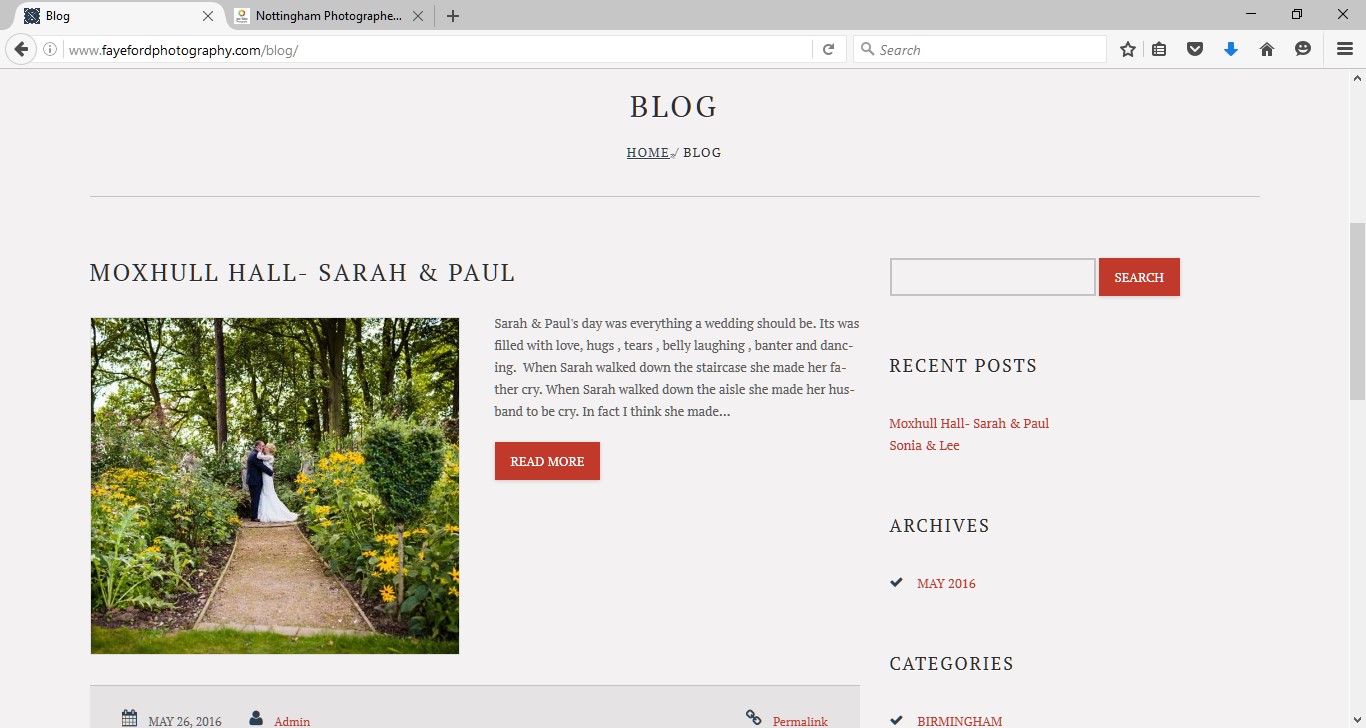
The
blog page shows you a blog of up to date work they have done with
clients. This shows customers more of your work and they can see what
you have recently been up to.
The
contact page has a simple contact form to fill out to submit if you
want to contact them or they have provided an email and phone number if
you want to contact them sooner. They have also provided an address so
you know where they are located.
The
home page has 9 tabs, 5 on one side, the logo in the middle and 4 on
the right side. There is also a larger image filling the screen and
arrows on the left to change the images. This allows the audience to see
some of the photographers work straight away and see the kind of style
they have.
The
gallery tab brings you to a selection of galleries to look through so
you can see the style and genres of work that the photographer works
with. They are layed out in a grid format which is an easy format to
look around.
The
wedding, portrait and commercial page give you information on the
service of each one that the photographer provides and shows a collage
of images taken by the photographer in this genre.
The
prices page only tells you about wedding prices so I assume you have to
contact the photographer to find out other prices. I would have added
other prices on to this page aswell to make it easier for people who are
interested in your services.
The blog tab shows you up to date blog work from the photographer so you can see what they have been up to photography wise.
He
has an 'about' page which goes in to detail of his professional
experience and a little bit about himself. This could help people who
are interested be more likely to use his services as they know a bit
more about him just than the fact hes a photographer.
He
has a simply layed out contact page with contact numbers and an address
so you people who are interested in his services can contact him.


No comments:
Post a Comment