Having an online presence is important as you can link your websites to social media sites like Facebook and Twitter where a lot of people will see your shared posts and then they can share it further. This will mean you will gain a wider audience.
I am going to look at 4 of these kinds of websites:
- http://www.zenfolio.com/uk (voted number 1 by professional photographers)
- http://www.squarespace.com/
- http://www.wix.com/
- http://www.weebly.com/uk/
Zenfolio

When you first enter the website the page is very simply layed out with few tabs for access to its other pages. This makes it easy to use.
When you click on the 'landscape' 'portraiture' or 'lifestyle' tabs, it takes you to a page with an example of someones photography website page (created with Zenfolio) with a quote underneath reviewing the website, in this case, the landscape one says:
"Zenfolio is such a powerful tool for my business as it allows me the peace of mind of knowing my images are safe while also allowing simple amendments and sales-management on the fly."
Joseph Roybal, Proud Zenfolio User Since 2011
If I was a landscape photographer and I saw this example and quote it would make me lean towards using Zenfolio for my own work as it sounds and looks positive and simple.

When you click on the 'features' tab, it takes you to a page explaning different features of the website in simple sentences and it is also layed out simply with simplistic images. Using simplistic layouts and images along with text makes it a lot easier to read and process and not get bored quickly like if you had a massive paragraph to read you would probably lose interest and click off of the website. If there is too much going on, the viewer doesn't know what to look at first as the scene is too busy, this can also make them lose interest quickly so it is better overall to keep a simple design.

There is a tab called 'examples' which when clicked takes you to a page with screenshots of photographers zenfolio websites. It is layed out in two columns in a square format which is simple and the white background (not a busy background) makes it easier to view. Allowing you to see other photographers examples would gear you towards creating your own website as you would imagine your own images in place of theirs and see how simple it looks to use.

The tab 'labs' takes you to a page of printing partner companies that you can add to your website in order to sell your products and gives a description of where the printing company ships their products to so you can see if your target audience company is on their and be satisfied straight away by this.

The 'plans' tab takes you to a page showing you the plans and pricing of managing your website. There is also a 'try it free' button located in the centre of the screen which is very easily visible so will attract viewers straight away and everyone likes 'free' things so this will draw them in straight away. The other prices are text over some brightly coloured boxes which make them stand out more. The lowest price is also placed first which will be a plus for getting customers as they will usually always be looking for a low price plan.

Photographer using Zenfolio
I then went on to view an example of a photographers website that they created using Zenfolio:
http://www.tomkeenanphotography.co.uk/
When you first enter Tom Keenans website, the whole page is a slideshow of his images which play through by themselves at quite a quick pace (so you don't get bored of looking at one image). You can also click through them yourself using the left and right arrow to view them more quickly. I think this is a good idea as you are displaying a lot of your work to the viewer in a short period of time and they don't have to click anything to view these as they are already there. I think this is effective as it draws the viewer in right away rather than them having to click on different tabs first of all to find your work.


His website has 5 tabs in the top right corner and two external links in the bottom left hand corner to his instagram page and his facebook page (social media pages).


The links take you direct to his social media where you can see up to date posts and images from Tom Keenan. Adding these enables people to follow your posts on other media so they can keep an eye on your work over time and even if they don't use your services straight away they may show friends these links or even after a period of time of seeing your work decide to use your services.
His 5 tabs are 'more information', 'about', 'client area', 'contact' and 'blog'.
When you click the 'more information' tab it takes you to a page where the first bit you see you can access the bit to contact him via a link in the paragraph.


If you scroll down the page that the 'more information' tab takes you to, you will scroll past 4 slideshows, one is a series of portraiture images, the next is a series of head shots, the one after that is a series of family portraiture and the last one is kids portraiture.
An example of what the head shots one looks like:

The slideshow plays automatically like on the homepage and there is a link to click 'visit headshots' which takes you to another page showing all of the head shot images he has chosen to include on his site.

By clicking on these you can view them in a large quality which is easier to see and so the viewer will make a quick decision based on what they can see as to whether the style of photography is what they would like to use your services for or not.
The images on the page are in simple columns and rows unlike some sites which have their images in a mosaic style. I think the more simple style is easier to view, especially with the white background and spacing as you can see the images more clearly more quickly which would make the viewer more happy to continue browsing the site.
I then clicked on the 'about' tab which had 2 drop down menus 'photographer' and 'testimonials'. I clicked on photographer:

The link takes you to a page which appears to be layed out like an informal blog with information about himself with some pictures. As a viewer myself, I like this as you can grasp an idea of how friendly the person is and know a bit about their personality so when it comes to using their services you do not feel nervous around them or at least less nervous than if you picked a photographer you knew nothing about. This would make you feel more confident about picking this photographer.
I then clicked on the 'testimonials' drop down menu:

This page has reviews from his clients about their service they received from Tom and then a slideshow of their images underneath.
This is a good idea as clients can see other people opinions which if positive can help decipher whether or not they want to use his services and give them more confidence to with positive comments.
I then clicked on the 'client area' tab:

If you end up using his services you can find your images on this page and if you are yet to use his services you can view these images taken for other clients to decide whether or not you will goon to use Toms services.
The 'contact' tab takes you to the same contact page as mentioned previously.
I then clicked the 'blog' tab:

It took me to the page of his blog which includes some of his shoots with clients and some behind the scenes stuff. It is a good idea to have a blog with your website as clients can view your work as you update it and the more up to date, the more likely they will think of using your services as they know you are still working with clients and available to book.
Weebly
www.weebly.com

Weeblys homepage is layed out very simply with just four tabs to go to different pages. The 'try it free' button is in bright blue which attracts you straight away, this is because people are more likely to make a website with weebly or any other company if it is for free. The font is white over a darker image which covers the whole screen. This makes the font very easy to see and read as it is also quite large, spaced out font.


They have external links to social media pages at the bottom of every page for easy access to them:


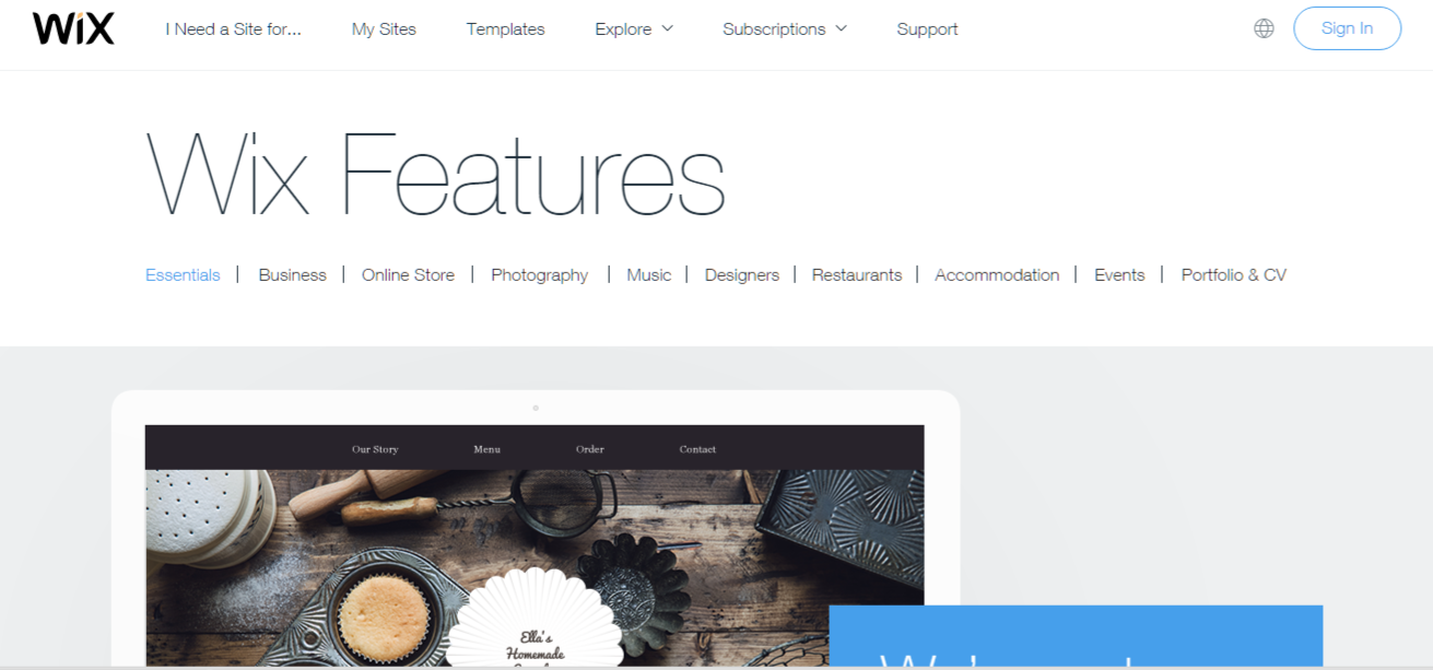
The homepage is simply layed out with 5 tabs, plus, a pop up of a list of types of website so you can get to work straight away with your chosen subject.


You can explore other peoples wix websites they have made through the site by clicking on the explore tab. This could help inspire you by showing you various designs and layouts you can also use.


It also shows you a large list of apps that you can add to your website if you want to.


www.squarespace.com


No comments:
Post a Comment